

Dullius
From broker to curator.
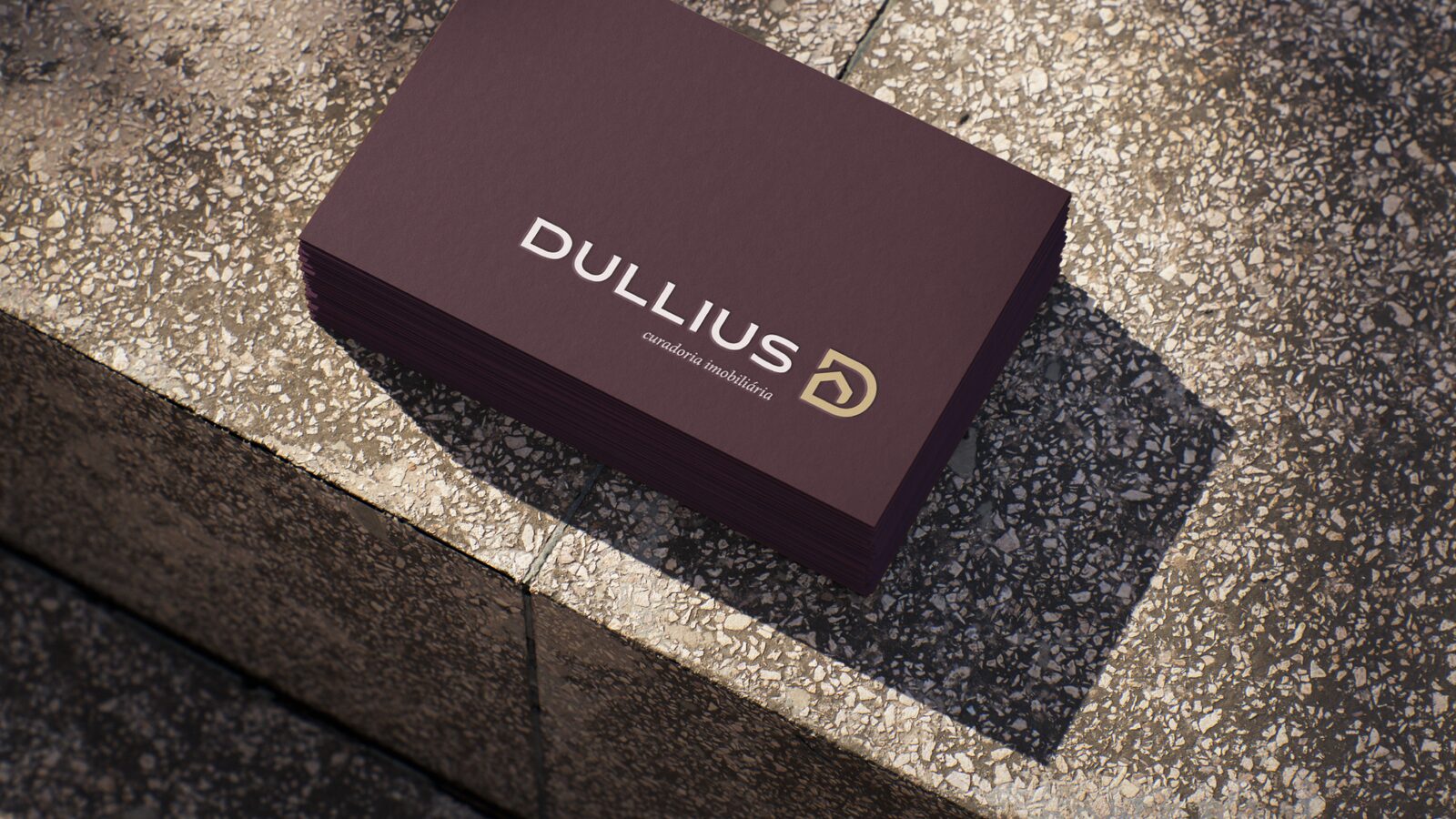
Katrin Dullius sold homes under her own name, and she wanted a business that could grow beyond her. The brand started from one word in how she describes her work.
01
The brief
A name that could grow beyond hers
Katrin was a real estate broker with no brand, only her own name. Her clients are high-income buyers looking for a home or an investment. She asked for a brand that wouldn’t depend on her name alone, one that could grow into a company.
02
The insight
She wasn’t selling. She was curating.
In our discovery session, Katrin described her market: too many listings, too little guidance, impersonal service, and agents who disappear once the deal is signed. Her own way of working was the opposite. She narrowed the options down, explained every legal and financial step, and stayed until the deed was in the client’s hands.
So the brand moved from corretora (broker) to curadora (curator): someone who selects with criteria and guides the decision.
03
The name
One word changed
“Curadoria imobiliária” means real estate curation. Dropping the first name was Katrin’s call. The surname gives the business room to grow while keeping her name on the door.


04
The symbol
A frame, a letter, a house
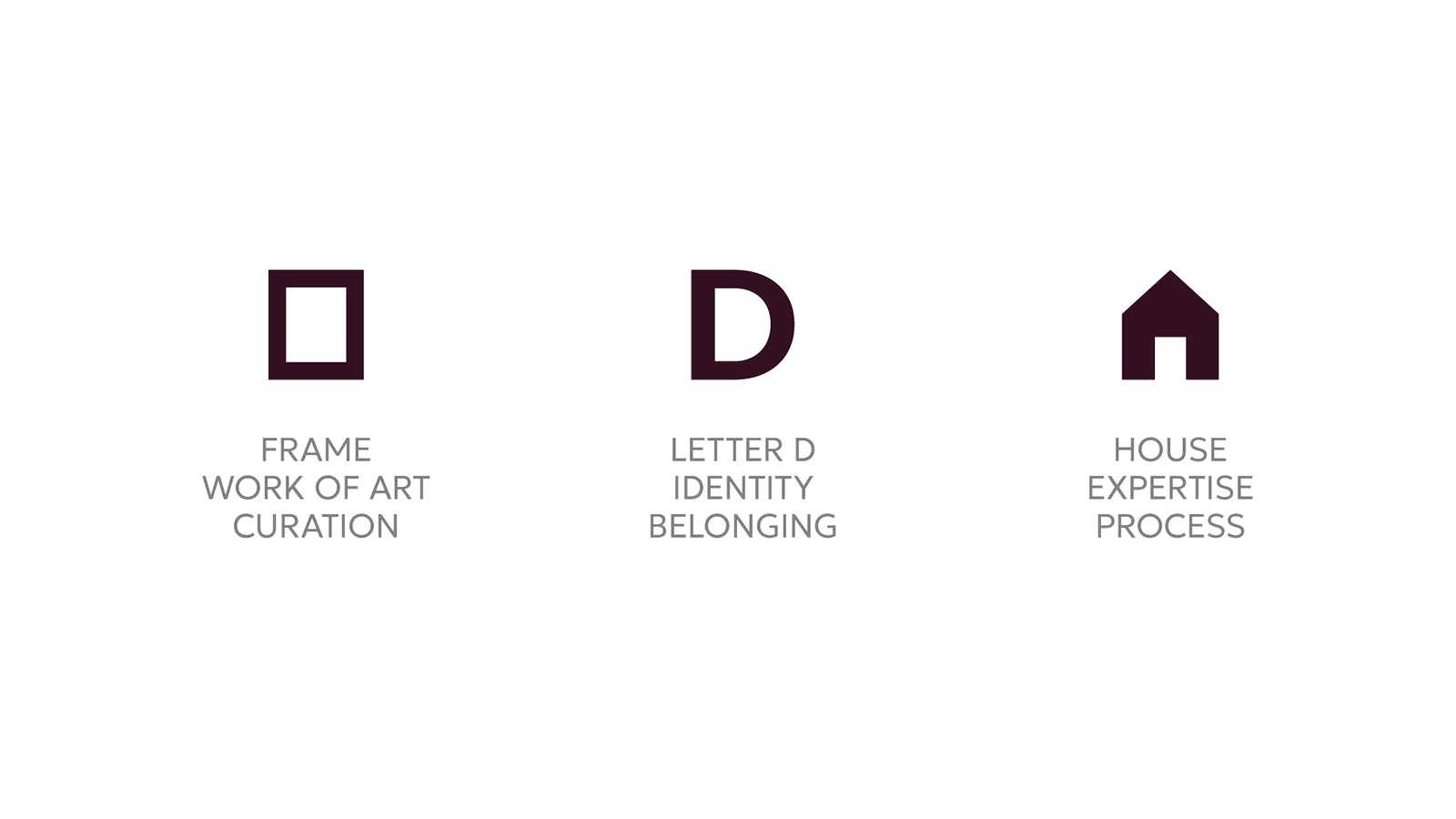
Three ideas in one shape: a frame, the way a gallery presents a work it has chosen; the letter D; and a house, for the property itself.


05
The system
Deep and warm, never loud
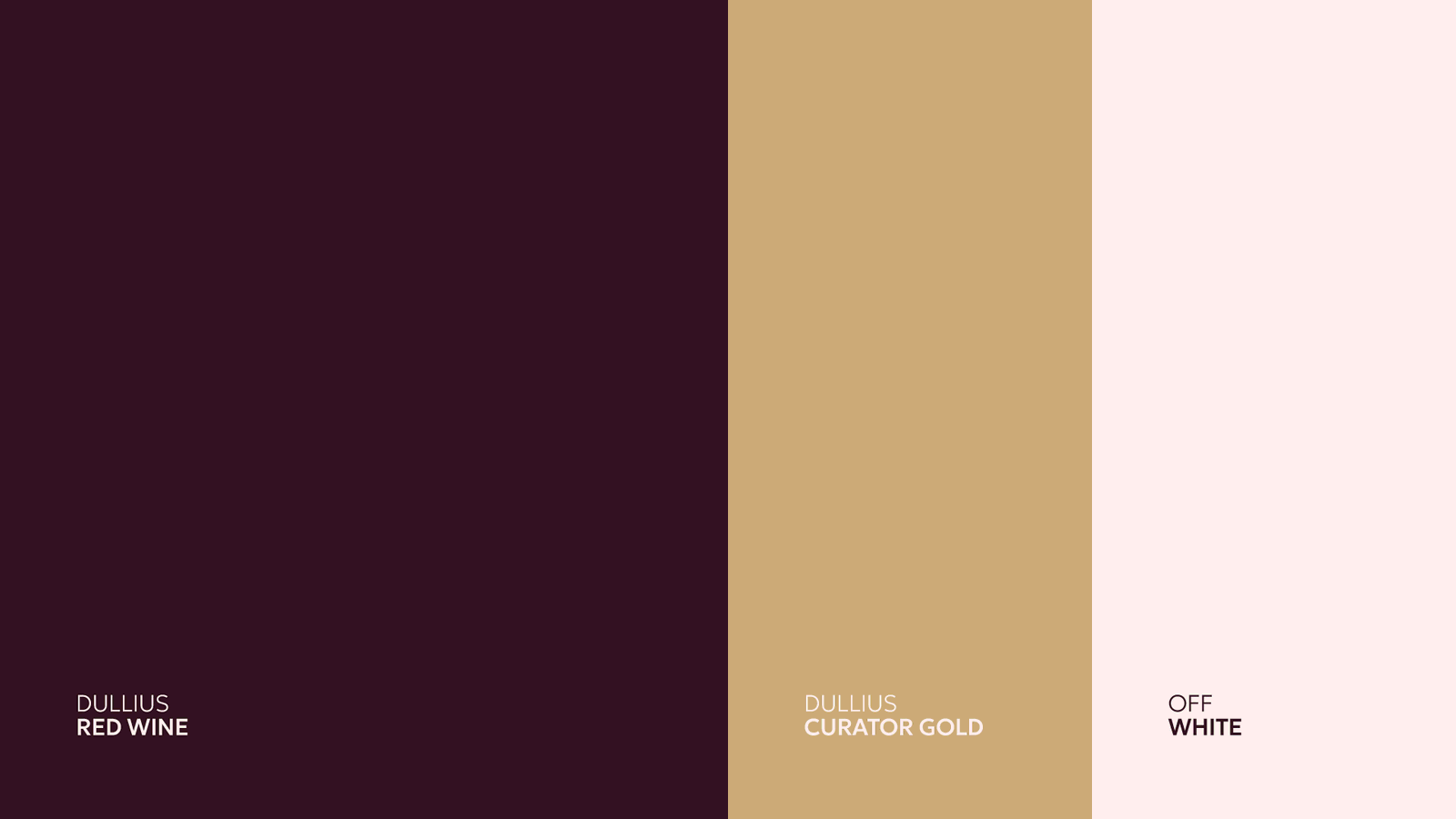
The wordmark starts from a clean, high-end typeface. I kept its structure and added small serifs to the D, U and S to give it personality. A palette of Red Wine, Curator Gold and Off White. Three typefaces with three jobs: Geologica for structure, Minion for warmth, and a handwritten script for personal notes.


06
A personal layer
The name scales. The care doesn’t.
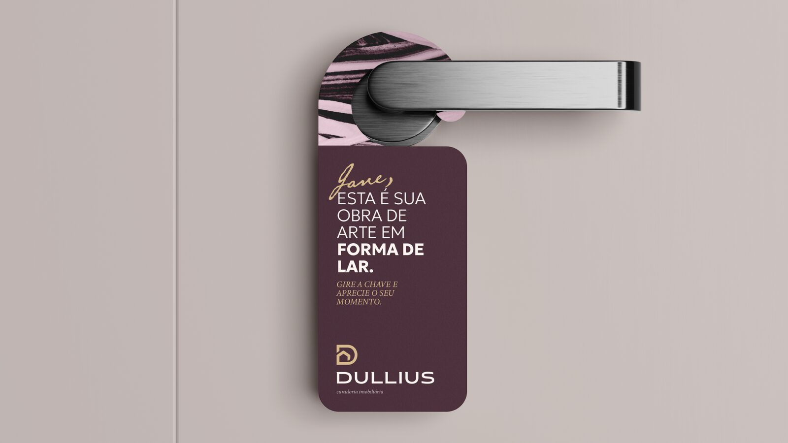
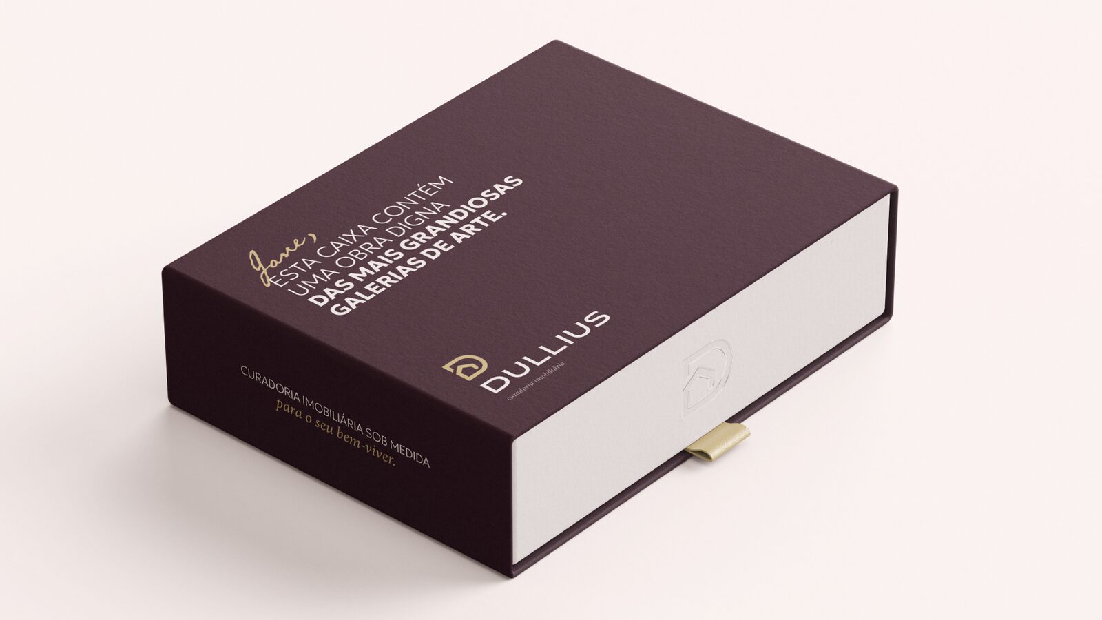
The handwritten script is used for one thing: addressing each buyer by name.
07
Strategy into objects
The deed, delivered
Katrin’s process ends with the deed in the buyer’s hands. The identity turns that moment into a ritual: a gift box with the documents, a key ring for the new keys, a door hanger for the first night in the new home, a bottle of wine.
The brand is in use today: Katrin works with the gift box, the business cards and the brand on social media.
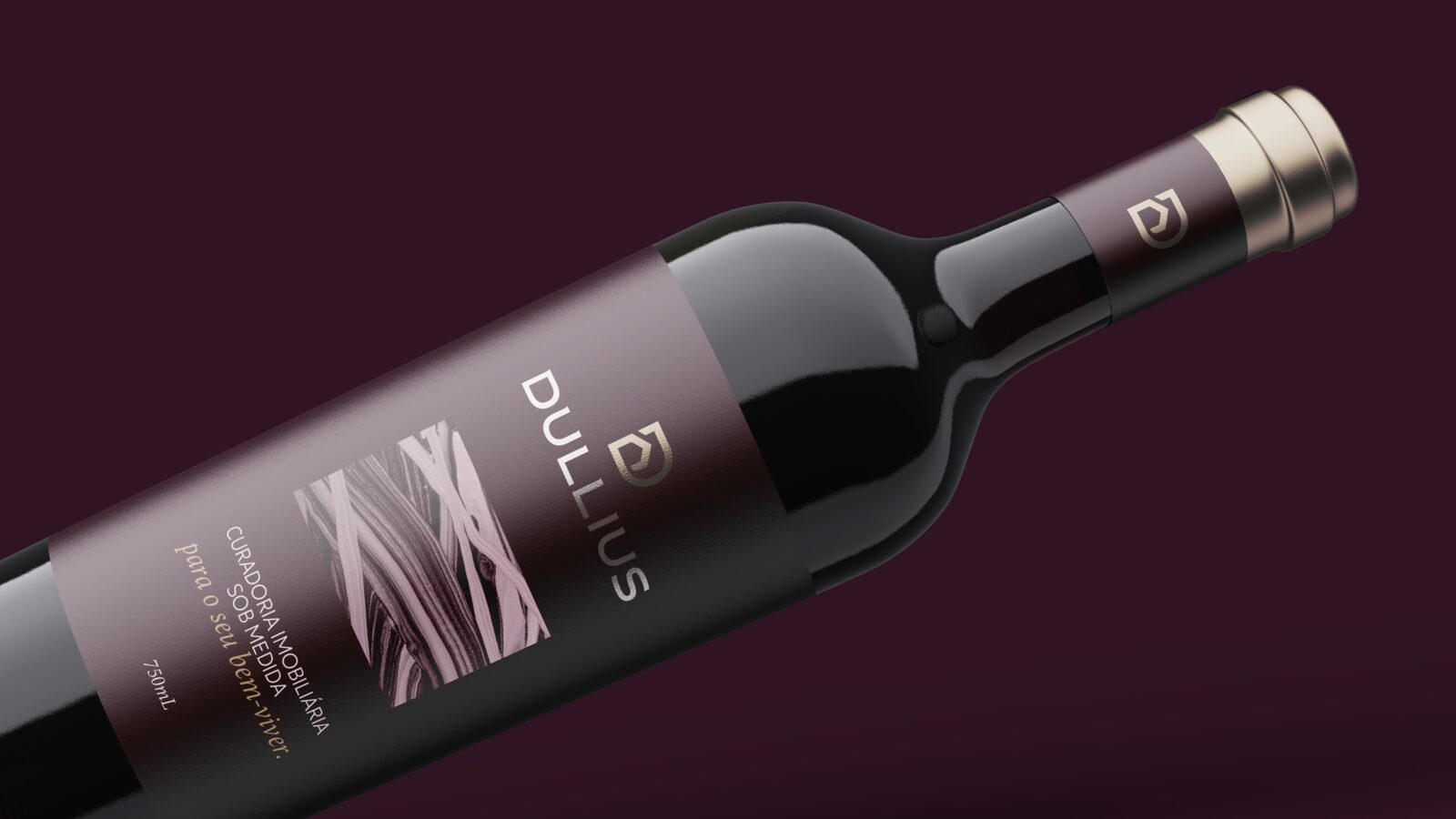
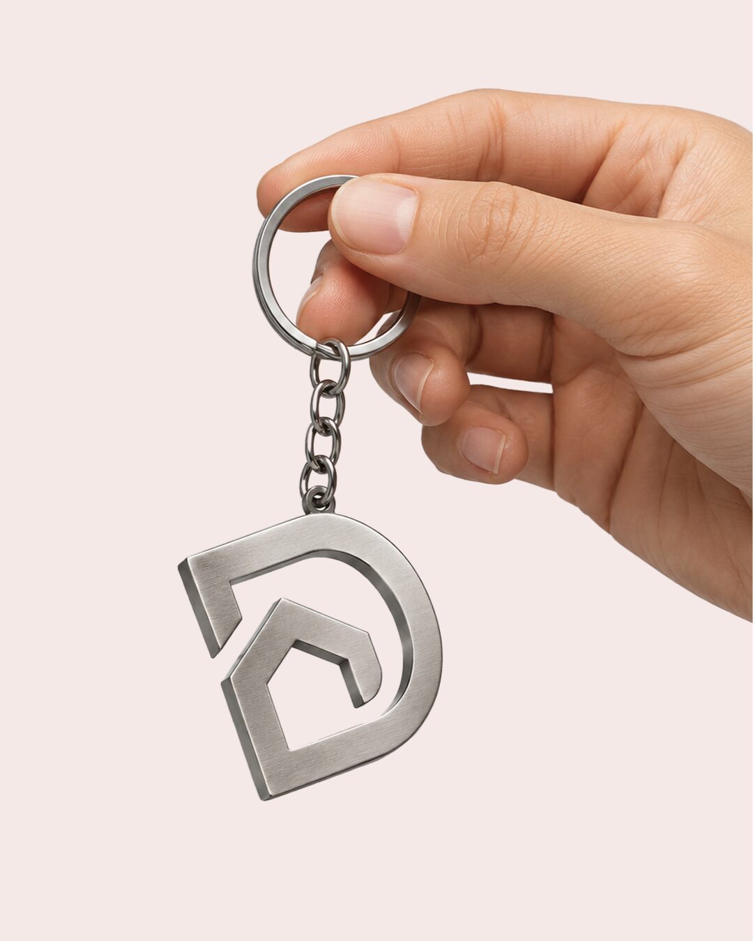
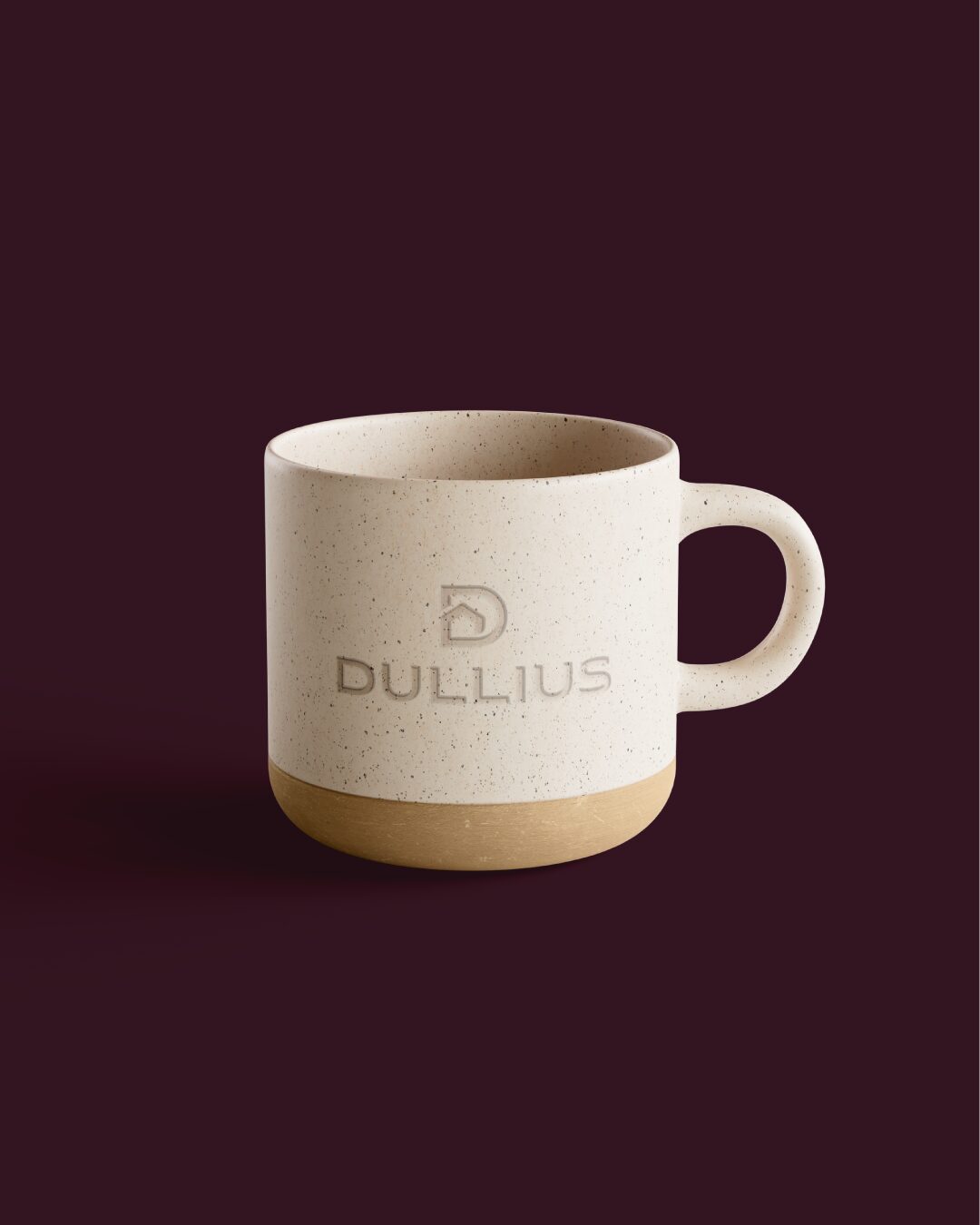

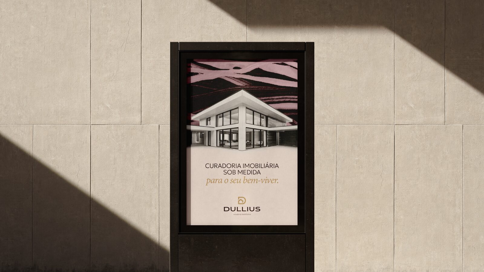
Mockups shown. The gift box, business cards and social media are in use.
In short
A broker sells what’s available.
A curator chooses what’s right.
Credits
Developed at my studio, Truworks.
Next case
Exnor Group →